Step 2: Visualizing cumulative polarity of sentiments across lines of text
The last post basically provided a run down of getting the data ready to use – reading in a text file that was then split into a CSV with polarity and subjectivity columns. This is sort of a bare minimum and the post itself may need to be expanded.
This post cuts that post short – because without some of the details it’s worse than useless.
Building on the last python script to create the CSV with polarity and subjectivity, several elements were added to graph the cumulative polarity of lines of text in the Stealing the Network books.
First – there is a little kludge to just the chapter number for the Stealing the Network books. 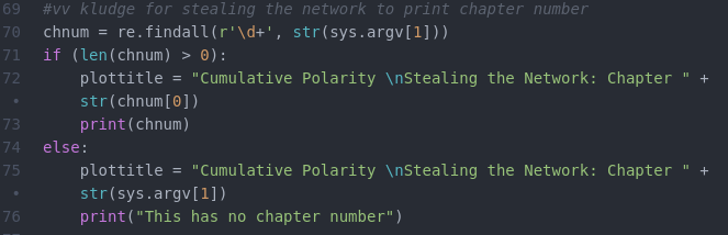
The actual graph generating code is pretty straight forward matplotlib code:
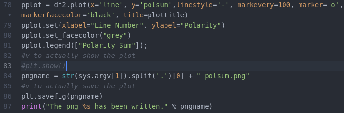
The complete code is here.
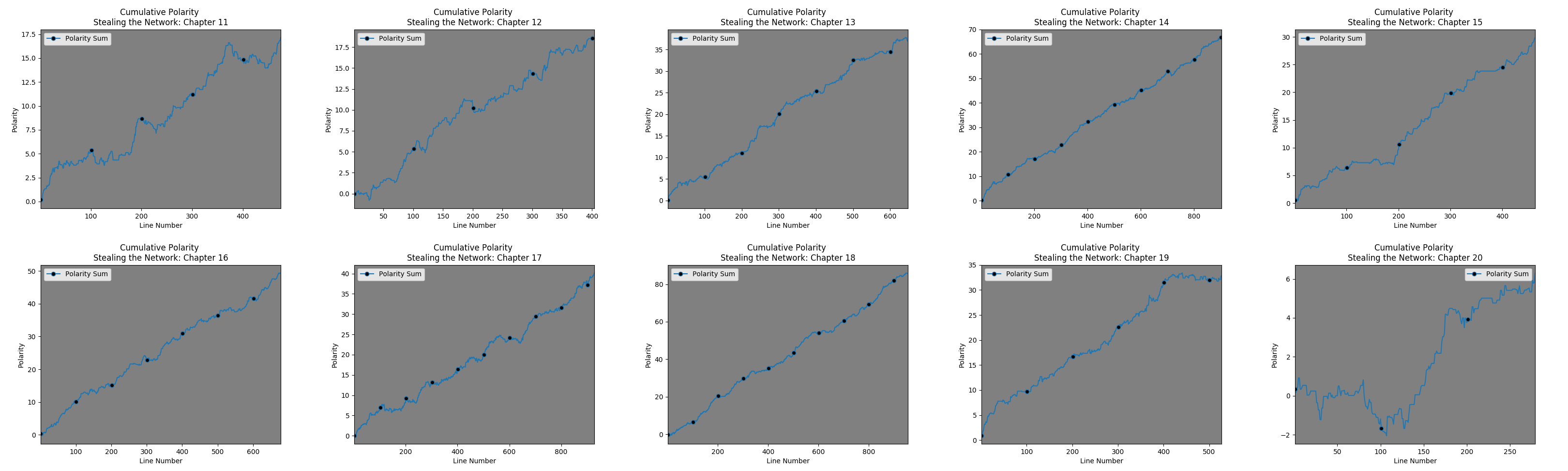
The following graphs illustrate what this code does. To get a sense of the polarity of the book, the cumulative polarity is shown line by line with the line number as the x axis and the polarity sum (present polarity added to all preceding lines), where polarity is between -1 and 1 (with 0 representing a neutral statement).
For comparison, I planned to show /var/log/syslog (by adding periods to the end of each line) – however, I discovered an SNMP bug generating error messages.
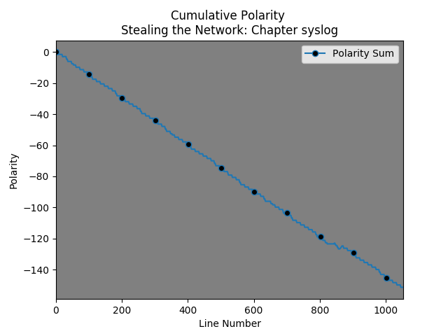
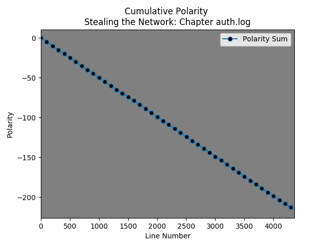
So, I decided to look at /var/log/auth.log and discovered that “closed” is evaluated as negative…. Note: The black dots occur every hundred lines.
This helps to contextualize the chapter by chapter cumulative polarity graphs from the “Stealing the Network” books.
Here is book 1: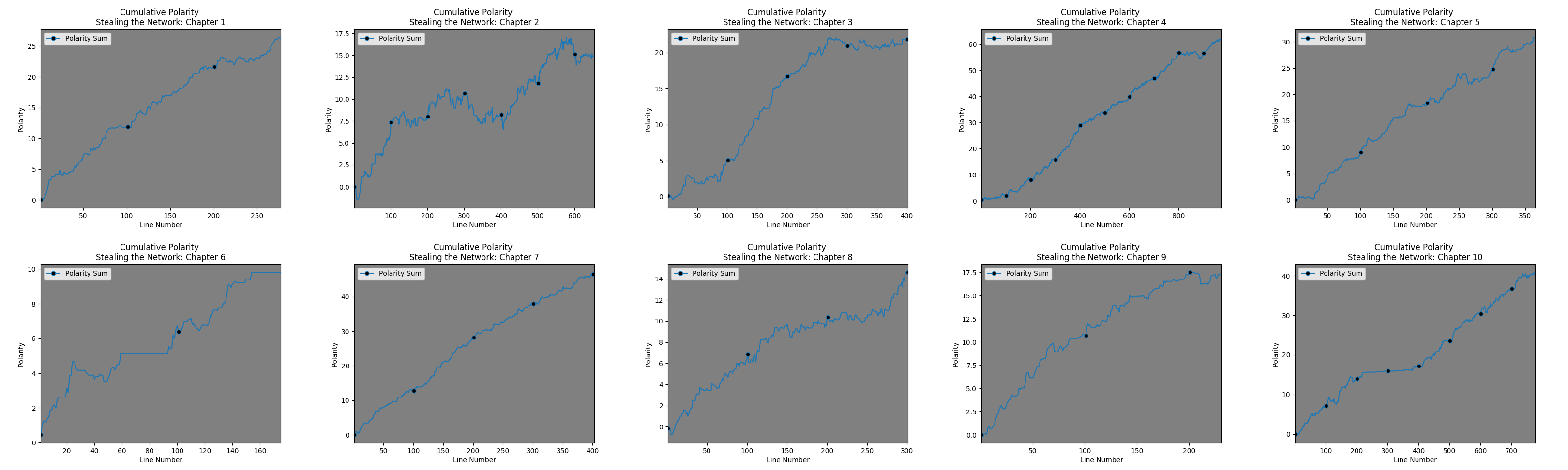
Here are the links to the Cumulative Polarity Sum graphs for book 2, book 3, and book 4.
The montages were generated using Image Magick’s montage command e.g. 
Why these are worse than useless
These graphs are problematic and worse than useless for multiple reasons.
- There is no consistency across axes.
- The X axis – notice the black dots – they are spaced to occur every hundred lines. Without looking closely, one might assume the texts are of comparable length. They are not – which is then exacerbated by:
- The Y axis – these graphs are autoscaled to the max Y value. Chapters 1 and 9 look similar but they have very different values.
- Behaviorally, it is hard to tell what is going on. Are there lots of positive and negatively valuated statements that balance each other out? Or is it simply a few positively valuated statements that make the chapter seem overall ‘positive’?