Step 3: Making the graphs more informative
The graphs from Step 2 were not the most helpful – and even worse – potentially misleading.
In order to make the graphs more useful, I needed to make some changes:
- compare apples to apples and oranges to oranges. The axes should be equal. This will help compare the progression of polarity in similar amounts of line/page time.
- Certainly, we may want to know a chapter’s “negative” polarity, but do we have enough information to decide that the statements “x is bad”, “x is very bad”, and “x is an absolutely horrible very bad error” are meaningfully different for what we want to know? Behaviorally, it might be more important to simply know how often “negative” and “positive” polarity statements are emitted. For comparison, it is much more common to measure the frequency of a rat’s lever presses rather than strength i.e. the frequency of a behavior is typically of more interest than its severity (but not always).
- We will want to disaggregate and compare total number of positive polarity and negative polarity statements side by side. [The strength of the response will/may be of interest later.]
First, I added two simple functions to determine if the statements are positive or negative. [Reminder: I teach novices. If you think this is too trivial to mention, I wholeheartedly invite you to teach CS at your local public high school.]
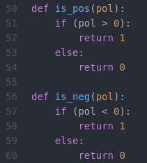
Then, I created the dataframe columns to simply note whether the line was positve or negative, and columns to tally cumulative numbers of positive and negative polarity statements.

Step 4: Making decent looking graphs
I spent an indecent amount of time ignoring internet recommendations for plotting multiple sub-plots on one graph using plotlib. Long story short, it’s necessary to create axis and figure objects that matplotlib works its magic on. fig, ax = plt.subplots(facecolor=’grey’)

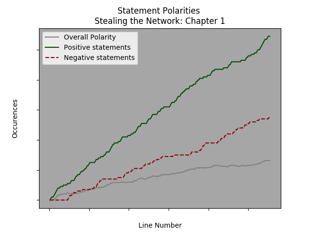
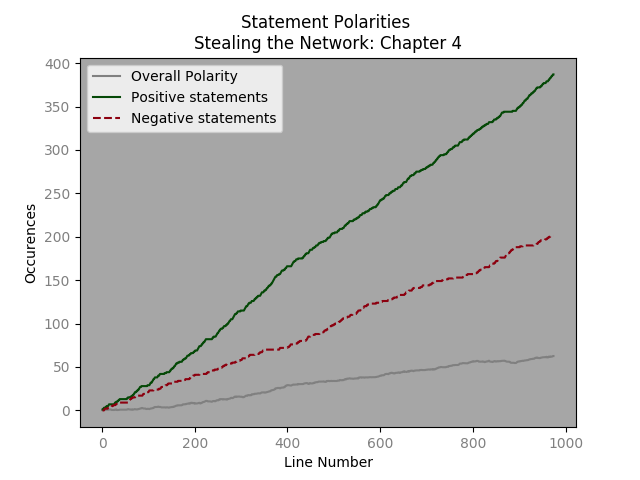
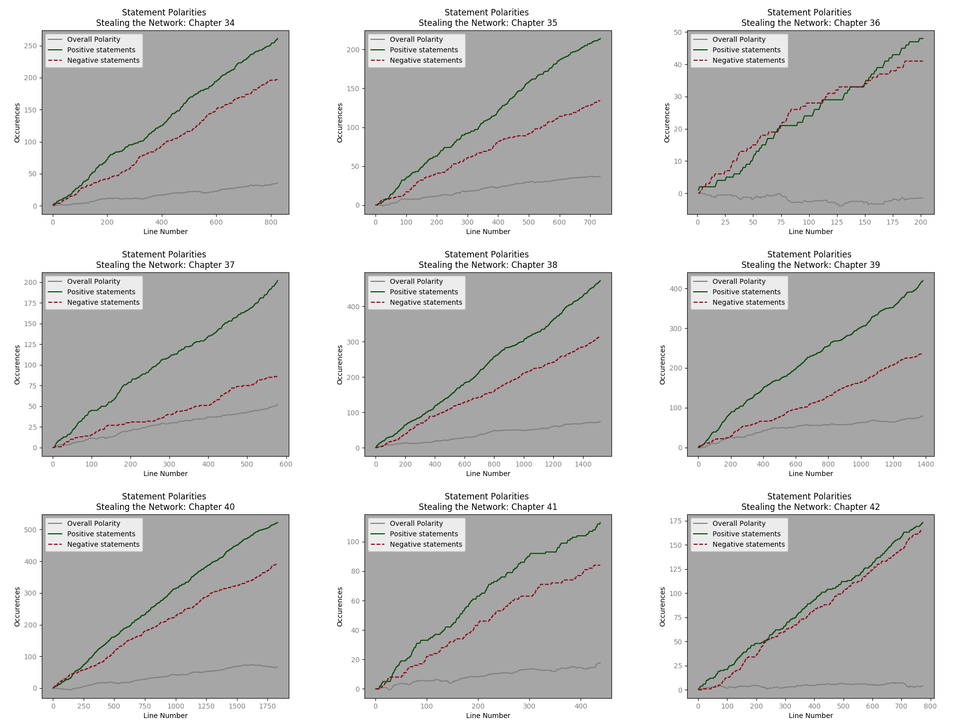
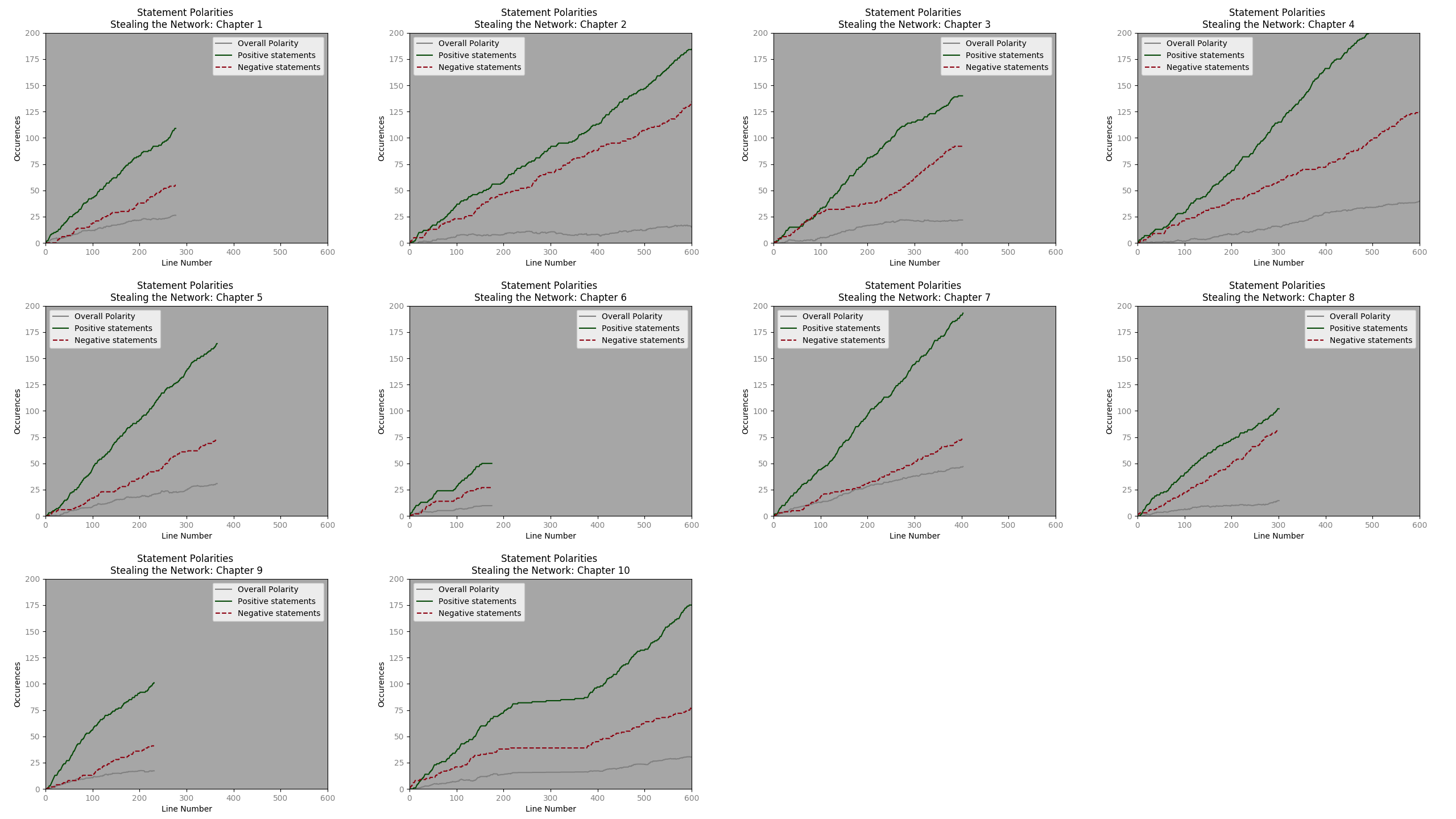
The plots are added – x,y,color, label and et voila a graph indicating increases in positive and negative polarity statements – as well as overall cumulative polarity. Here are examples from chapters 1 , 4 and a montage from book 4. The code to make them is here. [Later, we will want to simply have one graph with values from each chapter or book.]
Step 5: apples to apples
Using a little Linux magic , we can find the average and median line counts of the chapters.
Line numbers: for stn in $(ls stn_[0-9]*txt); do wc -l “$stn”|grep -o ‘^[^ ]*’ >> lens; done
Average length: awk ‘{ total += $1; count++ } END { print total/count }’ lens
Median length: cat lens | awk ‘{arr[NR]=$1}
END { if (NR%2==1) print arr[(NR+1)/2]; else print (arr[NR/2]+arr[NR/2+1])/2}’ #[Found here]
From all books the average chapter length is 804 lines and the median length is 1017 lines. However, in the first book the median line # is 396 and average line numbers are 630. A quick visual analysis of chapter 1 suggests that a y range (statement polarity) of 200 and an x limit of 600 seem reasonable.
The montage from the first book is then:
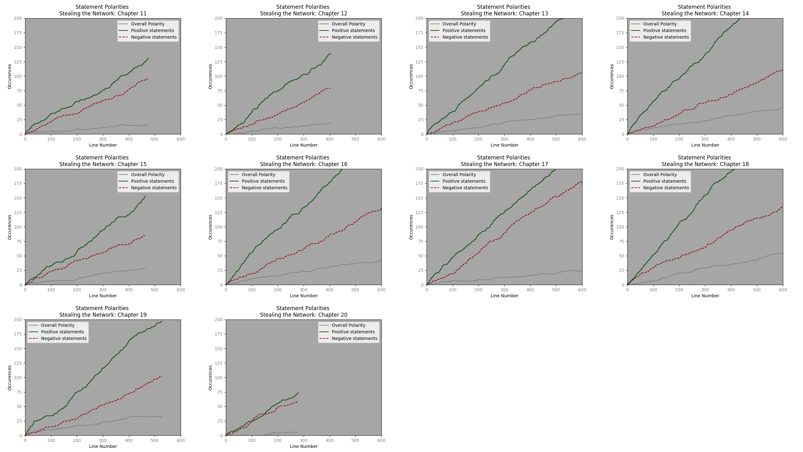
Using the same Axes-
Chapter 2:
Chapter 3:
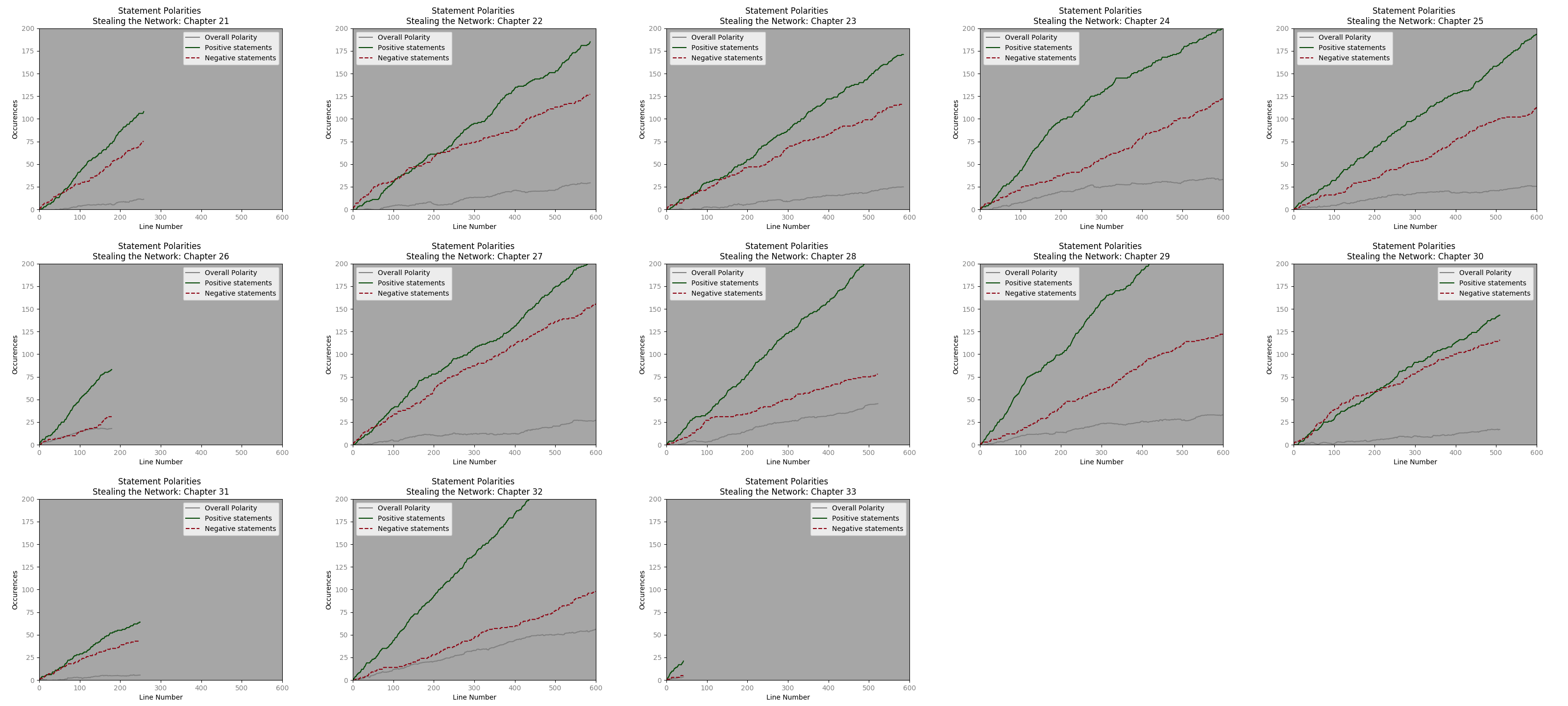
Chapter 4:

Excepting a few chapters, the progression of positive polarity and negative polarity statements, seems very similar. It will be interesting to see how this upholds with regards to other dialogue types.